Recently, Stephen Gordon from Université Laval showed a graph illustrating real earnings on a weekly basis during the recession at each percentile of the earnigns distribution. I wonder how his grah would look like if extrapolated backwards to the late 1960s. However, I think that looking at earnings is misleading. I believe that consumption is a better measure, especially in societies where preferences are growing increasingly heteregeneous. What I mean by that is that the richer we are, the less we need to use income to satisfy certain desires. Hence the rise of what Tyler Cowen dubbed “threshold earners”. Cowen describes them in the following manner:
It is also the case that any society with a lot of “threshold earners” is likely to experience growing income inequality. A threshold earner is someone who seeks to earn a certain amount of money and no more. If wages go up, that person will respond by seeking less work or by working less hard or less often. That person simply wants to “get by” in terms of absolute earning power in order to experience other gains in the form of leisure—whether spending time with friends and family, walking in the woods and so on. Luck aside, that person’s income will never rise much above the threshold.
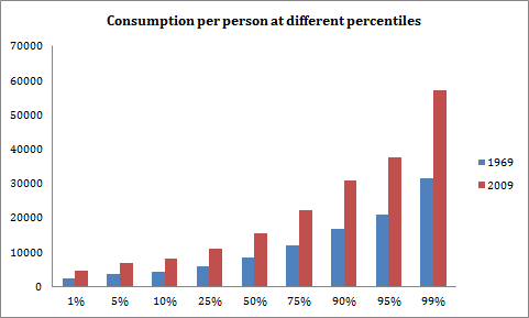
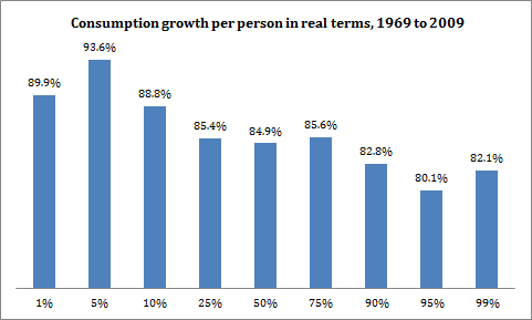
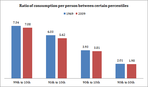
In such a situation, I believe that using consumption measures (which also allow us to control for the effects of both a growing student population – needing credit to smooth consumption – and a growing elderly class using accumulated savings) is more efficient. So to expand on Gordon’s comments, I use the Survey of Family Expenditures of 1969 and the Survey of Household Spending of 2009 to see how things changed in the in-between period with regards to the distribution of consumption. I think the figures show a less dramatic portrait of reality. In fact, it seems slightly positive.
However, I would tend to argue that provincial adjustements would count in for a lot (aggregating all the provinces means assuming equal prices across the country – a dubious assertion). Moreover, I would tend to think that the price index – like Broda argues in the United States – is biased against the poor. As a reason, I would tend to believe that these graphs overstate the case that inequality did not increase as much as often argued, but it feels that even accounting for these problems, the increase in overall inequality would be very much less impressive than done.
